-->

Hospital Interior Design | Emma Children's Hospital AMC | Amsterdam | Opera Amsterdam


OPERA Amsterdam designs interior of the Emma Children's Hospital AMC (EKZ)

The Emma Children's Hospital, situated on the top floor of the Academic Medical Centre in Amsterdam is currently undergoing a drastic transformation. The first unit, Infants Care and Staff, became operational in January 2010, next phases ( children, teenagers, oncology, surgery, intensive care, theatre, playgrounds, lounges, terraces and area's for contemplation ) will be completed up until 2013.
In total the project's footprint is 8800 m2.

The architects from OD205 signed up for the architectural design and OPERA Amsterdam is responsible for the interior design. OPERA interpreted the question to modernize the Children's Hospital at a more fundamental level and designed an integrated approach for the project. After all, the EKZ doesn't only treat infants but also young adolescents and all ages in between. Each of these groups requires different surroundings and age-specific facilities, while at the same time the hospital also needs to be perceived as a coherent structure. Besides the (young) patients, the needs of parents en employees can't be neglected.
Naturally the design does not interfere with the primary processes of the hospital.

Office Interior Design | Net-A-Porter | Westfield | London | Studiofibre


When Net-A-Porter were compelled to move their head office to the top floor of ‘The Village’ at London’s new urban shopping temple, Westfield, they ran a competition to find their perfect design partner, resulting with Studiofibre being awarded the task of leading them through this exciting journey from concept to completion, providing full project design, bespoke joinery design & production and furniture & fittings specification &
procurement.

Retail Interior Design | Surefoot Aspen | The los Angeles Design Group


The store’s design problem turns on an issue of legibility: Surefoot sells a fitting process that is unique to the industry, but the store is stocked with rows of intensively patterned and colored boots from immediately recognizable global brands. How can an intangible process supersede or visually insinuate itself into the slick glamour of an industrial design object? The diffusion of the custom-fitting process compounds this design problem; it occurs in a series of small episodes that are not immediately legible as having anything to do with skiing or footwear. In order to fit a boot, Surefoot uses a digital scanner to create a topographic map of the customer's foot, which is in sent to a computer numerically controlled mill to fabricate an orthotic insert. The process is completed by injecting rapid-hardening foam into the liner of a boot while the customer stands on a canted platform designed to simulate the position and resultant stresses of the foot and ankle against the ski boot while skiing. Uninitiated customers can't understand what the staff technicians are doing without a spatial system to indicate that each episode in the custom fitting process scattered throughout the store is part of a coherent whole and a recognizable brand.........more

Music Studio Interior DesignEffigy Studios | Ferndale, Michigan | inFORM Studio


The nature of the recording studio is one of isolation, both figuratively and physically. Three major wrappings (Control, Isolation and Dispersion) have been introduced into the existing structure to address both the isolation and sound quality needs. Two smaller insertions (the vocal isolation booth and the courtyard) create focused moments in the project, pieces that address the quality of the space aside from the technical sound needs. The architectural interventions do not extend past the edges of the found object - they are completely contained by the container. There is little to no indication upon approach to the project of the internal interventions that create the functional spaces. The first room entered, the event room, is a large multiuse space. It is conceived, conceptually, as exterior. The true front elevation and major entrance threshold is approached only after stepping through the initial skin of the existing entrance. The event space is an interstitial space, non-programmed and transitional. From this volume, the core of the studio can be accessed through a significant threshold which occupies the same location as the present cut in the masonry wall. Light floods into this space from erosion of the walls surrounding the courtyard.....more

Office Interior Design | Netherlands Embassy in Madrid | Madrid | Spain


Interior of the new offices of the Netherlands embassy in Madrid, housed on the 36th and 37th floor of the Pei Cobb Freed and partners-designed Torre Espacio skyscraper. At this level, the tower has a lens-shaped floor plan, so that the interior has a configuration with a lot of curved outlines. Furthermore, in accordance with cepezed-philosophy the embassy interior has been designed with a lot of transparancy, so that the grand views over the city and its surroundings are almost omnipresent. As other embassies of the Netherlands' Crown, the post in Madrid has also been decorated with an abundance of Dutch art and Dutch design furniture.....more

Office Interior Design | AMP Circular Quay | Sydney, Australia | Architectus


Our challenge was to provide AMP with an international standard meeting facility, while meeting their brief on issues such as disabled access, occupational health and effect on the environment.

Through a thorough briefing process with different views of the proposed facility, various different applications and scale of facilities were discussed and agreed.

Architectus designed the floor to maximise flexibility and included conference, lecture, training and informal areas within this heritage listed space.

Architectus also coordinated services consultants to ensure the fitout was as mindful of sustainable methods and resource usage as possible.........more

Showroom Interior Design | VERSTEEL | New York City | SPG


This showroom, located in the New York Design Center at 200 Lexington Avenue, is the first NYC venue for Versteel. As one of several showrooms on the same floor, the space was designed to provide visual simplicity and subtly invite curiosity. Schedule and budgetary constraints dictated the creative use of easily installed elements and finishes. Visitors are drawn into the space by a stainless steel and glass wall sheathed in a film which, when seen obliquely, appears translucent, but when viewed directly, appears transparent. Overhead lights and internally lit custom furniture plinths provide points of dramatic focus while a poured acrylic floor coating provides reflective depth to the existing concrete slab......more

Museum Interior Design | Sterling Millwork | Farmington Hills, Michigan | inFORM Studio


Conceived as a museum of millwork, the interior forms within the office space are presented as artistic sculptures that are visually independent but collectively define space. Each artistic gesture is an avatar of the craftsmen's talent in a particular material or medium. The sculptures are holistic and penetrations within the sculptures are controlled by elements inherent to the sculpture itself. The insertions are intertwined to define space and provide cohesion between elements, while maintaining their individuality. The interior gallery imposes itself upon the exterior, eroding the northwest corner of the existing structure to form a new entry and picture window. Symbolizing a regenerative process similar to the peeling of skin, the exterior articulation embodies a stripping away of the old existing membrane, revealing a fresh layer beneath. Recladding the exterior soffit with patina copper panels and cladding the exposed wall surface with tarnished copper panels reveals the evolutionary attributes of construction materials. Simultaneously, the new exterior insertions allude to the exuberance of the interior when unified with the picture window, bringing the gallery to the street. The plan is composed to afford an observer from the exterior a view through the entire public space, with the reception area receiving special prominence within a framed aperture. ....more

Office Interior Design | enovate IT | Ferndale, Michigan | inFORM Studio

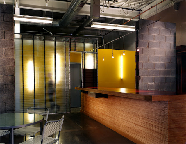
A woven set of interventions permeate a 50's industrial building rekindling life into an adaptive reuse project with flexible programming, establishing a quality of workspace out of what, to most, seemed limited potential. The sequence of movement is expressed by contiguous formal articulations that relate more to circulation and a hierarchy of spatial definition (public vs. private), than their pure autonomous definition. The strategy of spatial quality has proven effective as two entirely independent corporations have organized their operations within the spaces as designed in lieu of redesign to meet conventional thinking.

The first was a North American headquarters for an Italian automotive designer, the second and current tenant of the space, Enovate IT, is a company specializing in mobile computerized systems integration dedicated to the healthcare sector......more

Corporate Interior | Patrick Corporation | Walsh Bay, NSW, Australia | Architectus


Patrick Corporation came to Architectus Interiors with a brief to create a contemporary interior for their executive office space within the parameters of a heritage building.

Our design solution sought to maximise the structure and nature of the pier building, while providing Patrick Corporation with new facilities and a clear identity.

The unique harbour views are maximized by uncluttered open plan offices and glazed meeting rooms allowing the maritime nature of Patrick's business to be brought into focus and supporting the organisations democratic culture.

Patrick's occupation of Pier 8/9 Walsh Bay successfully blended the needs of a very progressive and modern firm within the fabric of a heritage building and delivered the message "Our work is as old as time, but the way we do it steps into the future".....more

Retail Interior Design | Ilo Interlomas | Arco Arquitectura


In search of a new image and concept, the main idea was to find a style that is warm, classic, elegant without setting aside a modern and innovative, the idea and concept that was used for this store was the concept of a skein of yarn in which there are always lines that intertwine. Within this first property gave emphasis to which access is governed by a material change and this was creating a strip of wood and topped with a large wall to the center of the store lined with Venetian mosaic, two touches of unique material in space. On the sides seek a modulation according to the materials used.

Modulating floors and taking modules of 60 cm. It began to play with vertical and horizontal lines for achieving this intersection of lines within these intersections were created some gaps and spaces to enclose the furniture. It should be mentioned that the lines generated besides this modulation followed the pace until the ceiling to create an envelope in the space with these lines generated in an abstract way....more

Cafe Interior Design | Gloria Jeans Cafe | México | Puuk Arquitectos

The project involves the creation of a Gloria Jeans Coffees franchise in rough terrain located in the Colonia Bosques de las Lomas. The concept stems from the local separation in two areas: operational and terrace tables. The operational area with bar preparation and care, as well as the backslash and farebox. Everything is designed according to a structured operating system brand. The terrace serves as space for the client, with an area for tables and rooms that make up a welcoming atmosphere. This space includes a fireplace with a retractable canvas, allowing the space to live in different environments......more

Office Interior | RogenSi | London | Studiofibre


RogenSi are a management consultancy who wanted a contemporary workspace that would reflect who they were and provide a creative environment for their staff whilst also offering a large, flexible, multi-purpose environment for their clientele to visit and train.
Using a crisp, clean palette incorporating plywood and cardboard bespoke furniture, the interior speaks of a company that can look at business with an ever fresh perspective........more

Restaurant Interior Design | Restaurant Okie Wokie Chicken Bamba | Santa Fe Mexico City | Arco Arquitectura


Oki Woki Chicken Restaurant Bamba in a union of Eastern food and chicken dishes as the main ingredient, located on the Mall in Santa Fe Zéntrica initial concept was to create the 2 pictures of this new food concept, merging them into a same space, later to be able to continue with a brand image and create franchises.

The use of materials, and the resolution of the shapes and space, create an effect of order, contrast and movement without losing a cozy feeling. The overall effect of the composition tends towards the vertical, separates and connects the space to find a middle ground that marks the main circulation indoors.

Main element predominant design a bench throughout the room, which functions as banking-ceiling mural, creating a continuous band which marks movement. The main material of this bench was the Venetian mosaic, using 4 colors in shades of green and yellow, and also has a series of phrases in 3 languages with the messages we find in fortune cookies at Chinese restaurants.....more

Office Interior | MN Program Offices | MAS Arquitectura

Workers of any company have always wanted a place: a space in which to develop their professional work at home, feeling comfortable at all times and enjoy common areas for job enrichment. These have been factors that have followed. The result: a stunning offices where the sea grass and warm materials are the major players.
Noting the physical layout we immediately notice the interest in open space chasing customers. Even the meeting area or the principal's office are closed, but are accessible from anywhere. In the same vein, the jobs have been arranged longitudinally along the window to take advantage of natural light and provide employees with spectacular views over the Atlantic Ocean.....more

Restaurant Interior Design | Restaurant Beirut | Santa Fe, Mexico City | PUUK Arquitectos

The proposed approach begins with the client to create a project for a restaurant located in Santa Fe, Mexico City, based on a reputable establishment of Lebanese food in Panama. Since the beginning of the process, the intention was to return to concepts of Arab culture, and use their reinterpretation for the creation of various architectural and decorative elements for a space to express in a language with its own identity. The space is on two floors, the floor is made up of the lobby area, take out, cold kitchen, hot kitchen, laundry, bar, bath and area for disabled guests. In the upper floor area has tables and a VIP lounge, children's area, public restrooms, office, dry cellar, staff area, cold room and freezer room. The concept has two main interventions which originate intentions in space, on one hand the intention of linking the lobby to the area of the main guests (double height) by a weeping wall which forms the main corridor and that league level space, with the sheet of water which splits the area of diners, the second concept is the separation of space on the mezzanine floor, the same that serves as a hall for VIP, children's area and restrooms and to accommodate some tables that are privatized main area diners.....more

Showroom Interior Design | Creative Rec Showroom | Dror


With this challenge, Dror tried to reflect the beauty and essences of Creative Recreation sneakers in the design of the interior space. Sometimes the attraction to an object is in its simplicity, minimalism, and timelessness. Other times, it is the unique quality and detail. This inspired Dror to break the space into two contrasting sides. One gives respect to the minimalist aesthetic, while the other highlights layers, blending of colors, and a rustic style. Those two directions translated into art and design choices, including a pair of commissioned paintings by artist Adam Krueger, that attempt to reflect the beauty and diversity of Creative Recreation sneakers....more
 
 
Designed By Art Small Interior | Proudly Powered by Blogger