-->

Condesa df Interior Design | Mexico City | India Mahdavi

In Mexico, Condesa df, is the district going up.
It feels a new energy, business and bohemia. Its Art Nouveau facades, bustling streets and pleasant, green space, keeping a romantic feel. Tina Modotti and Edward Weston, two mythical 20s, do not they are the emblem?
But the charm of Condesa df combines past and future. Recently, bars, artist studios, galleries, restaurants flourish in this exclusive perimeter.
The urban adventure Condesa df is still in its infancy.
Hence the quality of air exciting the attraction of this center conveniently located off the main arteries.
Named after the neighborhood and inspired by him, a hotel with forty rooms opens Condesa df. Located at the intersection of streets airy, facing the lush park Espana, the building is an elegant Parisian style building dated 1928.
Three years of work were needed to completely hollow and restructure the old apartment complex. It was worth the wait. For a drink or a few nights, the Hotel Condesa df is now the place to see and be seen in Mexico.
Innovative and fully integrated into local life, Condesa df would have been possible without the synergy of international talent that participated in its realization. Parisian India Mahdavi, "hot-name" interior architecture, designed the space planning and decorating.
The American Jonathan Morr, leader of the New York-taste "the imagined pleasures of the table. Helena Ishbiah, renowned graphic designer, has invented his visual identification.
The origin and the implementation of the project rests with Mexican Carlos Couturier and Moises Micha SMEK, young partners of Hotel Habita in Mexico City. Condesa df exudes modernity.
The hotel grows at its height the codes for a new chic, informal and relaxed, showing a "me" said. Punctuating the space, the classic-contemporary furnishings created by India Mahdavi sets the tone: at once simple and glamorous, neutral and pop.
The atmosphere is on the wire always unexpected. The bar in the boudoir, the restaurant at the nightclub, the patio at La Terrazza, Condesa df, offers its guests a concentrated experience.

Enjoy the succession of moments, quiet or fun, is it not the essence of modern life?.......more

Cafateria Interior At Applemore College | Southampton, UK | SHH


Tight-budget spatial transformation of a Southampton secondary school dining area as a trial project for UK government body The School Food Trust (in close consultation with The Sorrell Foundation). The new graphic-led 'streetwise' dining concept united previously disjointed spaces, helped the servery and queueing system to function better. External spill-out furniture included belisha beacons set into screeded-off concrete stools.....more

VERSTEEL New York City | SPG Architects


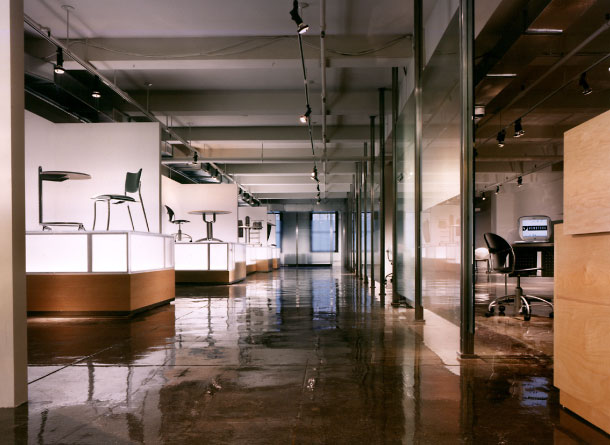
This showroom, located in the New York Design Center at 200 Lexington Avenue, is the first NYC venue for Versteel. As one of several showrooms on the same floor, the space was designed to provide visual simplicity and subtly invite curiosity. Schedule and budgetary constraints dictated the creative use of easily installed elements and finishes. Visitors are drawn into the space by a stainless steel and glass wall sheathed in a film which, when seen obliquely, appears translucent, but when viewed directly, appears transparent. Overhead lights and internally lit custom furniture plinths provide points of dramatic focus while a poured acrylic floor coating provides reflective depth to the existing concrete slab.....more

Retail Interior Design | Hubert H women | Regensburg, Germany | BERSCHNEIDER+BERSCHNEIDER


The deliberate contrast old - new voices in an overall picture. In a medieval town house as a first step, the old space and facade forms were recovered, adjusted excesses of many conversions. Traces of history like pillars, vaults, columns from the Romanesque to the Baroque than refurbished items in the rooms to find and read again. By vitrification of the openings of the medieval courtyard flowing seamlessly into the store room. The new development adheres to the history of clear, simple and elegant back. Technique was to plan possible "hidden ". Reduction to a few materials: stainless steel, white painted surfaces, sand, stone floor and oak wood. Only a few spots of color-conscious. Sophisticated atmosphere with no frills and decoration, staged light on historical backdrop of the new women's store.....more

Restaurant Interior Design | Ichizen | London | SHH


SHH created the identity, graphics and interior design concept for a new Japanese noodle bar called Ichizen in London's 'NoHo' area, north of Oxford Street. Working around the limitations of the conservation area location and the size of the space itself (around 1200 sq ft of front-of-house space), the designers created and implemented the design within three months, with two thirds of the budget going into infrastructure.........more

Restaurant Interior Design | Germain | Saint Germain des Prés, Paris | India Mahdavi


At the invitation of Thierry Costes, India Mahdavi delivers first public project in Paris: a contemporary version of the bistro, revisited in a vintage spirit. Opened in May 2009, the place appears: Crude but chic, but familiar alternative.
"For Germain, I'm proper codes Parisian bistro, before the hijack, the revisit. I wanted this place to be nourished by a history, a tradition but it can also break free ... deconstruct the space by playing with scale, proportions, and patterns. "From the superposition of these multiple frames (floor tile cement pixelated black and white, luminous ceiling graphic, marble bar faceted) punctuated with bright colors to furniture, lime green, orange, and orchestrated by Sophie, the yellow sculpture Veilhan springs the impression of a "never seen" a place without concession, but that each may appropriate. Germain was born......more

Hospital Interior Design | Obstetrics Ward | DEXEUS | Barcelona | GCA arquitectos asociados


Interior design for obstetrics ward. Here the designers have used materials and finishes to create a warm, functional, and non-pretentious environment. A unique space within the gamut of health centers, the design also includes flexibility in the form of moveable elements......more

Bar Interior Design | Bar Left | Lisbon Portugal | Ricardo Carvalho + Joana Vilhena


The intervention in the old warehouse from the early twentieth century for the installation of a coffee bar focuses on valuing the proportions of the existing space (5mx 5m x 18m). The project is built as an open tube system to Largo Vitorino Damasio enabling a direct relationship between interior and exterior, causing the events that take place in the coffee bar to public space and transporting the motion of the inner city.

The formal choices translate into a reduction of elements and materials in order to appreciate the moments of enjoyment indoors: a black box as an input filter, a steel bench that is a memory and other tight spaces and long counter in corian white as the centerpiece of movement and stays. The toilets and stairs (for access to the mezzanine) in dark red are also of an abstract presence of ambiguity by its scale and function. Artificial light is the main element of manipulation of environments that allow the continuing transformation of the environment and the transition between day and night.....more

Bar Interior Design | Stockholm Furniture Fair | Camp Site and Wis Design


Title: Design Bar by Camp Site
Object: Interior design and exhibition
Year: 2009

Description: Together with the design collective Camp Site, we have created the Design Bar of 2009 at Stockholm Furniture Fair.

This is not just a temporary designed bar at Stockholm Furniture Fair. This is also an up-coming cafe and meeting point in one of Stockholm ’s suburbs, run by the Red Cross. When the fair is over, this room will revive as the brand new and much longed for interior in a meeting point for people of different ages and with different backgrounds
Chairs and tables, benches and carpets, lightening and textiles - they are all designed with a purpose more long lasting than being a decoration in a bar for a couple of days. And just by being here, taking a break with a cup of coffee and a sandwich, you as well contribute to the project.....more

Exhibition Design | Dandy | Nordiska Museet, Stockholm | From Us With Love


What is a dandy? What does he look like? Some say a dandy is a particular person. Others say a dandy is a way of life. The architecture of the exhibition dissect the dandy into pieces, in order to expose the details that makes the Dandy.

Architecture for the exhibition "Dandy" at Nordiska Museet, Stockholm.
The architecture consists of dismembered mannequins, fused with MDF boxes which then has been laqcuered in a slate grey, giving the illusion that a stonecutter has started working on sculptures, but only finished the parts essential for the exhibition pieces.

The exhibition gives examples of how a contemporary Dandy could look. Tailor Frederik Andersen, fashion researcher Rickard Lindqvist, journalist Olaf Enckell, stylist Lalle Johnson, author Björn af Kleen, designer Göran Sundberg and shop owner Christian Quaglia have all given their suggestions on the modern style dandy.......more

Hotel Interior Design | Nhow Hotel | Berlin | Germany | Karim Rashid


Nhow hotel celebrates Berlin’s modern zeitgeist and connects it to the rest of the world by creating a technorganic land of data-driven art and spaces. Set on the Spree River, the old line between East and West Berlin, the Nhow hotel bridges the digital age of information and the physical and spiritual needs of visitors. The two towers are designed for different needs. The East Tower rooms feature a sunrise/sunset color scheme of warm golds and invigorating fuchsia. The West Tower Technolux rooms have cooler color schemes of grey, blue and pale pink. High aloft the hotel, the Upper towers have premium views of the Spree River, and are awash in calm colors, ideal for business traveler or peaceful get-away.....more
Client: NH Hotels
Facilities: 304 guest rooms, conference facilities, recording studio, restaurant, bar/lounge, wellness center
Area: 29,000 sqm

Hotel Interior | Donat Hotel | Rogaška Slatina | Slovenia | API Architects


A comprehensive renovation of the Donat hotel by architect Borut Pečenko is a part of designing a refreshed image of an established architecture with an aim to carry out programme and functional modernisation. The renovation comprises interventions at various locations. A coffee house has been designed as a conservatory and is entirely glazed. Its construction is also made of glass, and pillars are positioned at a distance of 13m. Its expressively designed architecture opens up towards the park and represents a counterpoint to the intimate space of the restaurant.........more
Place: Rogaška Slatina / Year: 2009 / Participants: Uroš Birsa, BArch, Anka Jurišević, BArch, Robert Robas, BArch, Milena Živanović, BArch, Jelena Trajković, Arch.student, Daniela Vidmar Podboj, MArch., Sabina Murtezič, Arch.student, Eva Furst, Arch.student, Katja Drač, Arch.student / Foto: Miran Kambič

Restaurant Interior Design | Umu Japanese Restaurant | Thailand | Design Worldwide Partnership


Dusit Thani Manila wanted to combine the spaces of its then two separate restaurants, a Vietnamese and a Japanese, to create one new signature Japanese restaurant for the hotel, bringing an addition of sophisticated fine dining venue to the city.

dwp was selected to provide the design consultancy and come up with a concept that would inspire the venue for authentic Japanese cuisine and contemporary ambience. The designer achieved this by blending varieties of traditional Japanese elements and materials which results in the unique Japanese fine dining experience.

The whole design concept was based on a journey in Kyoto. The restaurant is divided into three dining areas set apart by different atmospheres, be it market zone for sushi and robata area, shogun palace for the main dining area, and Japanese home for private dining. A 3-dimensional wall treatment, reflecting the uniqueness of Japanese origami, adds a visual interest and contemporary feel to the restaurant.

The restaurant was recently shortlisted as one of the top-four for Best Restaurant/Lounge – Luxury, by Hotel and Motel Management in their recent Hotel World's Global Hospitality & Design Awards Competition 2008, Las Vegas, Nevada.

Competition entries were judged by the editorial staff of Hotel & Motel Management, Hotel Design and Luxury Hotelier magazines.........more

Refurbishment Viaduct Arches To A Commercial Spaces | Zurich | EM2N


In this project we examine two essential questions: How can an infrastructure element that is a protected monument be programmed and made part of the urban system? In an era with an increasing amount of regulations (energy, hygiene, fire protection etc.) and greater demands for comfort, how can low-budget projects be carried out?
The viaduct is more than just a bridge. Like a mountain chain erected by human hand it appears in the town with a scale derived from the landscape and topography. The infrastructure element, originally used as a railway line, is to form a linear park that will be part of a culture, work and leisure mile.
This reprogramming of the viaduct initiates two decisive urban impulses: a spatial barrier becomes a linking structure, and the outdoor spaces bordering it are upgraded. The viaduct becomes a large-scale connecting machine and a linear building. We view this ambivalence as a fundamental quality and use it as the architectural leitmotiv to symbiotically connect the new uses with the viaduct structure. The characteristic Cyclopean masonry here forms the central atmospheric element.
The new structures are deliberately restrained so as to emphasise the existing arches.In fitting-out the interiors the future users can choose from a kit of elements or design the spaces themselves.....more

Hotel Interior | Hotel City Garden | Zug | Switzerland | Designed By EM2N


Name: hotel city garden
Time: 04/2009 - 12/2009
Location: zug
Client: mz-immobilien ag
Year: 2009
Type: hotel
Award: best.architects 11
Status: realised........more

Bar Interior Design | b side Wine Bar Designed by Kariouk Associates

Location: Ottawa, Ontario
Project Dates: 2008
Task: To design a downtown night spot with a seductive street presence.

Project Description:

The challenge of this project was to create an elegant interior for a new wine bar within the very long and narrow ground-floor space of a turn-of-the-century building that had only two windows at one end; the building's exterior curb-side front was to be converted to an additional seating area to be used seasonally. These objectives were to be achieved with a miniscule budget.
Project Response:

The design solution aimed to make the space appear larger by dematerializing the perimeter walls of the interior. First, the walls were entirely clad with mirrors (a costly material that was salvaged from the space's previous occupant). Then, new obscured-glass panels patterned with silver leaf were installed several inches in front of the mirrors. Concealed uplights placed between the mirrored and glass layers reflect light between the backs of the silver-leafed areas and the mirrors, causing the already numerous silver-leafed "squares" to be further multiplied and appear to float throughout the interior. In this way, the otherwise solid wall is broken down and given depth thereby creating a luminous, dreamlike interior; despite the space's shortage of windows, there is no "bad seat in the house." Silver-toned, shear fabric screens whose softness complements the glass walls, were designed to allow the interior to have the capacity to accommodate periodic, more private seatings, but to remain as open as possible for general use. A similar strategy was used for the new exterior patio, which was wrapped in 10-foot tall silver-toned translucent fabric walls illuminated from within by many wine-goblet lights suspended at various heights. Seen from the sidewalk, the patio appears as a giant, billowing lantern drawing in night-time urbanites.
Testimonials:

"After hearing rumours that b/Side was open, we decided to check it out... The decor is modern, dark with great glass panels along the walls and an illuminated bar showcasing the wine on offer."

"The place is gorgeous... The muslin screens for the patio is particularly notable, it's beautiful inside as well." ...more

Office Interior Design | ARB Office | London | designed by dRMM


The initial brief for the refit of the Architects Registration Board's offices was not just in recognition of the need for a modern workplace, but to recognise a new openess and accessibility in the organisation for the profession and public.

ARB occupies the ground floor of a standard 60's block on the corner of Hallam and Weymouth Street. Externally a nondescript brick and sash windowed envelope over a 6m concrete frame. Internally what was a cellular collection of offices and file storage forming the labyrinthine legacy of the former ARCUK. The brief for ARB's offices was not just in recognition of the practical need for a modern workplace, updating an inadequately serviced poor spatial arrangement, but to recognise the importance of a new openess and accessibility in the organisation for the profession and public. The brief called for the opposite of what was existing, i.e. ARB's offices should be transparent, fresh, friendly, lean, modern and serious. The design response has been to make a new Weymouth Street entrance (and hence address), remove as many internal doors and walls as possible, and to provide a continuous flexible open plan working environment with an 'island' service core and boardroom. All services and data are re-routed into a prefabricated underfloor heating and cooling system. The ceiling is notable for carrying nothing but light reflection, a white mirror. When the Board are not sitting, the boardroom divides into meeting rooms for staff, architects, students, public and press alike.....more

Restaurant Interior | Ovni Restaurant | Barcelona | AV62 Arquitectos


It was to make a fast food restaurant, based on buffet of salads and pasta or pizza where you can eat for 5 euros. A quick but quality food and little manipulation. It was essential to give an idea of the highest quality and hygiene does not mask the price advantage. The option price is a clear claim to the public, but forces you to think in a room providing a rapid turnover of diners. In the entrance floor houses the bar buffet with a rotating container which allows access to different foods quickly and in a small space, making useful the two sides of the bar. On this floor is a bar with stools and a table space. In the basement are also placed tables and try to improve the conditions of a priori most inhospitable space as above with the contribution of natural light through a skylight placed in the local access......more

Hotel Interior Design | Casa Fuster Hotel | Barcelona | GCA Arquitectos Associados


Paseo de Gracia, 132. Barcelona

Re-conversion of Domènch i Montaner's modernist building into a luxury hotel. The hotel's function has been adapted to the building. Therefore, the basement, ground and first floor, with diaphanous spaces supoorted on columns, house the communal areas, while openings in the façade allow the repetition of rooms on the upper floors.....more

Home Interior | Family House | The Hague | Hofman Dujardin


The living, the kitchen, the dining and the bedrooms are connected through the new extension on the garden side of the house. The extension with its generous roof lights transforms the ordinary house into a spacious and transparent house with a lot of daylight and visual relations to the beautiful garden.....more

Cafe Interior Design | MGM Mirage City Center Buffet | Las Vegas, Nevada | LTL Architects


23,000 sq.ft.

LTL Architects was selected to design the major in-house dining venue for Aria, the CityCenter's 61-story main casino and condo tower. The design negotiates between the desire for visual openness - views to serving areas and adjacent pool deck - and the need to produce a sense of intimacy within an expansive floor plate. The requirement for an efficient plan with minimal obstructions shifted the focus of the design to the ceiling, where a series of undulating cloud-like canopies migrate across the space, shifting in section to define the dining areas below. Incorporating lighting and acoustical dampening, the canopies allow for spatial articulation of the otherwise open plan, creating a series of semi-enclosed rooms without obstructing view and movement throughout. Banquette seating echoes the cadence of the ceiling to further define these zones while fields of glass cylinders extend cross grain to the canopies. In contrast to the institutional quality of the typical Vegas buffet, the design creates an interior landscape that offers contrasting areas of repose and movement......more
 
 
Designed By Art Small Interior | Proudly Powered by Blogger